With 40 years of experience from Nestlé as a designer, teacher in marketing and worldwide speaker, Lars G. Wallentin can convey the art of communicating through great packaging design. He is today an appreciated lecturer for technicians, marketing people and design agencies and he's somewhat of a packaging God! In this tailor-made article for Ecolean news-letter readers, he gives us his view of the ultimate packaging design.  Lars opinion on what's most challenging when creating a packaging design: The company must start from the beginning with the following:
- The brand must have a CLEAR position
- The packaging design must have:- an idea/a concept!- have a flawless and unique finish
- The design must be viewed in a wider context i.e. be a part of a TOTAL communication; packaging-in store material-secondary packaging-promotion etc.
The ultimate milk pack design
 Is there one? Yes, of course! Not only one, but several, as it all depends on the type of pack (shape, material, etc.), the cultural environment and trade channel. Here are some advice from 50 years dealing with milk pack designs from China to Brazil, from France to Indonesia. The most efficient way to analyse these packs is to treat each part of the design separately. There are basically 9 parts:
- 1. Colour(s) to choose
- 2. Brand
- 3. Milk symbols
- 4. Freshness
- 5. Natural/purity
- 6. Useful information
- 7. Storytelling
- 8. Local
- 9. Differentiation
If each of these parts is optimised, it is just a matter of putting them together and here the type of pack obviously plays a role. The pack types I have in mind are the following:
- plastic, e.g. ECOLEAN (2 panels)
- carton, e.g. Tetra brick, Combibloc, etc. (4 panels)
The good old glass bottle can today be forgotten, although it played a great role to promote home delivery of milk in many Anglo-Saxon markets. The famous first tetrahedron is obviously still valid, but today more used for cream than for milk.
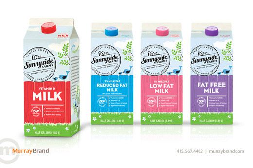
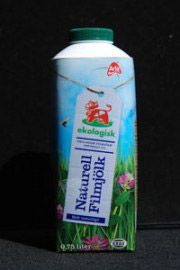
1. Colours
The best colour for a milk pack is no colour, i.e. white as the product. The big question is just how much. Too little white and the pack will not look fresh and pure enough. Too much of it and it will have little shelf impact, i.e. contrast and interest. Then there is clean white or off-white (i.e. 'dirty' white). Contrast is important, as it amplifies the white. The second colour is either green (fresh spring green and not olive green) or blue (fresh light sky-blue and not royal blue). I would say that 80% of all milk packages have this basic trio, with the addition of red to increase impact and to inform about something special. Yes, there are exceptions, as there are many solutions to achieve great designs.
2. Brand
Here I'd say that a milk brand follows basically the above rule. I was personally involved in the design of the Nestlé milk category logotype which, when tested, received very high scores. Unfortunately, I learn that it is being dropped, which I find a pity. If an established brand is being introduced into the milk category, it can obviously have totally different colours than those mentioned above.
3. Milk symbols
 There are many symbols which make this category so interesting and varied from a designer's point of view: Green fields, old milk churns, a cow's head, a milk splash, a cowbell, flower patterns, etc. Having said this, unfortunately many of these icons are not designed, but stuck on as a decoration, thus neither integrated and optimised, nor used throughout all other media. There is still room for improvements
4. Freshness comes from:
- the colour scheme;
- the material, i.e. how cold the pack feels when held in your hand;
- water droplets (as for soft drinks);
- green fields and grass which takes your mind away from being an industrial product.
5. Natural/purity
Basically the same comments as for freshness, but more a question of quality seal (e.g. approved by an institution) and green leaves. Words and figures chosen are of great importance, such as for instance 100%, etc.
6. Useful information
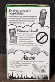 Most consumers know that milk contains calcium, but it does not harm to repeat it. Do not highlight too much the vitamins as it gives an image that the milk has been 'industrialised' which is not so much appreciated today. See below under "Local". Fat content is obviously useful information, as this is something the consumer understands. The back panel, which I call the "service panel", can be of two types:
- information about the product (see below);
- information of great interest, not necessarily related to milk. This is what Arla in Sweden is so good at. One can no doubt say that the service panel on an Arla milk pack is as interesting as the daily newspaper!
7. Storytelling
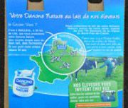 Well, all great pack designs tell an interesting story. The one I've chosen for this article is the Danone yoghurt in France with "milk from our farmers". Please note:
- the grass leaves;
- the luck-bringing ladybird;
- the use of a glass jar, although the yoghurt is in a plastic tub. Glass is perceived as more natural and fresh;
- the name of the farmer in Normandy.
Congratulations! This is great communication and a concept we all embrace. This brings us over to…
8. Local
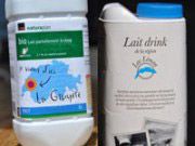 The more local, the fresher the product! I can buy milk from "La Gruyère" known for its cheese, as well as "de la région du Lac Léman" where I live.
9. Differentiation
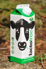 In order to clearly inform the consumer of the various types of milk, you best use words – not small words, but big ones! Drink, Light, Lactose free, etc. If these words are backed up by a colour-coding, you are safe, but watch out that the colour coding does not kill the freshness by replacing white with a colour! Here I can add a 10th advice and that is the level of DESIGN. The experienced designer works in 3D (see ill. lacto free from Arla), i.e. he lets the design elements overlap, or even continue on another side. This experienced designer also understands the value of the symbolic verbal (quality stamp) and visual (the farmer Vincent) language.
In closing
I do hope the above advice will be useful to milk producers, as well as to designers! Lars Wallentin